Ja nu kādam pēkšņi gadās saskarties ar šamo, tad es būtu ieinteresēts aplūkot, kas tur ir iekšā. Varbūt kāds var pdf kataogu atsūtīt vai kaut ko tamlīdzīgu? Es atradu informāciju kādā vācu e-veikalā, bet nu man ar to deutch tā ir kā ir.

Ja nu kādam pēkšņi gadās saskarties ar šamo, tad es būtu ieinteresēts aplūkot, kas tur ir iekšā. Varbūt kāds var pdf kataogu atsūtīt vai kaut ko tamlīdzīgu? Es atradu informāciju kādā vācu e-veikalā, bet nu man ar to deutch tā ir kā ir.
Windows Vista nāk ar daudziem jaunumiem un es pat sāku domāt, vai tiešām man jau ir pienācis laiks iztērēt kārtējos simtus latu, lai uzlabotu sava datora veiktspēju atbilstoši Vista prasībām.
Par vienu no jaunumiem es jau rakstīju iepriekš (vairāk jaunumu gan var uzzināt Microsoft Color Management lapā), bet šis ir kas stipri interesantāks – XPS formāts, ko prezentē Microsoft.
The XPS Document format provides a safe and secure way to store and share an electronic document. The layout of the content is fixed and does not contain any arbitrary code, macros, or scripts. XPS Documents include built-in support for digital signatures and can be protected by using rights management applications that use Windows RMS. These features provide a very stable, secure, and reliable document platform and make XPS Documents ideal for applications that require accurate presentation of the document’s contents, adherence to data governance, protection of sensitive information, or long-term document storage.
Windows Vista introduces the XPS Document format and uses it as a document format, a Windows spool file format, and a page description language (PDL) for printers. Microsoft understands that maintaining a high quality print environment in the enterprise is very important to the IT Professional and Windows Vista use of XPS technologies throughout the document life cycle and print path greatly improves print predictability, reliability, fidelity, and performance. (Avots: Windows Hardware Developement Central)
Es neticu, ka ir kāda jēga salīdzināt XPS ar PDF formātu, ko tik drosmīgi dara Digital Times (drīzāk gan aiz iemesla, ka nevar iedomāties, par ko tad vēl interesantu uzrakstīt), tomēr idejas, kas ir izmantotas šī formāta izveidē ir apsveicamas un dažas no tām, visticamāk, visdrīzākajā laikā papildinās PS valodas jauno versiju.
Pirmkārt jau šīs nedēļas spārnotais teiciens: «We typically hear customers ask for features that CS2 already has. We hold our tontongues because what we really want to hear is WHY they couldn’t find those features. Maybe we didn’t think of that, or maybe we never imagined people would do it that way.» Creative Suite Design Team Manager STEVE JOHNSON
Ja visi tā domātu, kā Stīvs, tad pasaule kļūtu rožaināka.
Maza dāvaniņa tiem, kas gaida no manis InDesign apmācības – šobrīd apmācības vairs nerakstu, jo galīgi tam nav laika, toties varu jūs iepriecināt ar dažām citu sagatavotām apmācībām. Pats pārskrēju tikai pāri – vispār dažas lietas daudziem varētu šķist interesantas. Ja kāds grib tā nopietni un pie nopietniem džekiem ar nikniem papīriem, tad tā arī var.
Bet mūsdienās vispār nekas vairs pašam nav jādara – tikai sapiķojam un iebliežam savu tekstu iekšā.
Post scriptum
Es ļoti labi zinu, ka uz šīs planētas 99% cilvēku uzskata, ka visi pārējie ir duraki. Bet tehniskā specifikācija, mīlīši, ir domāta tam, lai jūs viņu lasītu, nevis tam, lai varētu papriecāties par «jauko klientu», kurš kaut ko tādu arī māk uztaisīt.
Superjautrie, manuprāt, ceļojumu apraksti. Visiem iesaku palasīt grūtajos brīžos.
Shitov.ru / Small world / Latvija
Savukārt man no tā visa, visvairāk patika šis:
Памятники делают из грустных смайликов.

Ir iznācis jaunākais, svaigākais saraksts ar Adobe programmu spraudņiem. Tas gan vairāk attiecas tieši uz CS un Acrobat lietotājiem, bet nu skatam cauri. Īpašu uzmanību pievērsiet spraudņiem, kas nāk ar apzīmējumu freelance, jo daudzi no viņiem man ir ļāvuši saīsināt darba stundas līdz darba minūtēm – tomēr tie, kas strādā ikdienā un paši priekš sevis kaut ko taisa, ir daudz tuvāki, nekā tie, kas taisa kaut ko citiem.
Divas lietas, par kurām es domāju.
Par pirmo domāju ne tikai es, visi blogi jau ir pied***ti ar ierakstiem par iPhone iznākšanu. Man vislabprātāk, protams, patīk Egora idejas par šo tēmu.

Savukārt otra lieta, par kuru es domāju, ir ArtLebedev. Tam kantorim ir manāms regress iestājies. Nebiju sen neko skatījies, bet tagad apskatot pēdējos darbus esmu vieglā šokā. Kas ir šis vai šis?
Es atvainojos, bet tas ir sū** kaut kāds.
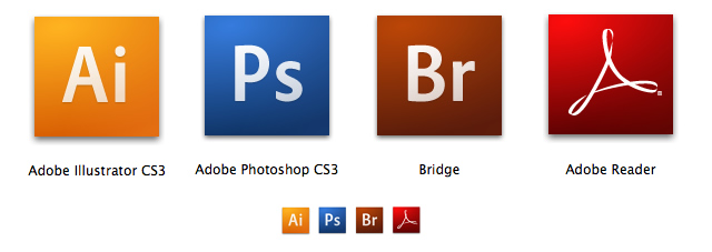
Man jau instalējot Photoshop CS3 Beta šķita, ka tas, ko es redzu, ir tikai programmeru uz ātru roku saveidotais, lai var testēt usability, bet kā izrādās, tad tas tiešām ir jaunais produktu dizains. Vairāk par šo lietu var lasīt šeit: The New Adobe Icons and Branding
Bet man personīgi no komentāriem vislabāk patika šis:
“Just curious…
Is Adobe trying to create their own version of a Periodic Table? :-)
L8R,
JD”
Lūdzu paši, draugi, jūsu sisadmini un visi pārējie – atjauniniet savu Adobe Acrobat Reader versiju šeit, jo tas tiešām ir gana liels un svarīgs atjauninājums kopš Acrobat ģimenes parādīšanās. Viens no būtiskākajiem atjauninājumiem – Acrobat Reader tagad ir ļoti ērts rīks komentēšanai un labošanai dokumentos, ja nav pilnā Acrobat ģimene, pārējie atjauninājumi in general:
Combine multiple files into a searchable, sortable PDF package that maintains the individual security settings and digital signatures of each included PDF document.
Automatically locate form fields in static PDF documents and convert them to interactive fields that can be filled electronically by anyone using Adobe Reader software*. (Windows® only)
Easily conduct shared reviews — without IT assistance — that allow review participants to see one another’s comments and track the status of the review.
Enable anyone using free Adobe Reader software* to participate in document reviews, fill and save electronic forms offline†, and digitally sign documents.
Permanently remove metadata, hidden layers, and other concealed information, and use redaction tools to permanently delete sensitive text, illustrations, or other content.
Configure Acrobat 8 Professional to automatically archive e-mail in Microsoft Outlook for easy search and retrieval. (Windows only)
Convert e-mail in Lotus Notes to Adobe PDF to facilitate searching, archiving, and retrieval. (Windows only)
Take advantage of improved functionality for saving Adobe PDF files as Microsoft Word documents, retaining the layout, fonts, formatting, and tables.
More rapidly convert AutoCAD® drawing files into compact, accurate PDF documents, without the need for the native desktop application.
Complete tasks more quickly with a streamlined user interface, new customizable toolbars, and a “Getting Started” page to visually direct you to commonly used features.
New features for the Photoshop CS3 beta include the following: