Society for News Design apkopojuši pagājušā gada labākos digitālos žurnālistu darbus

Society for News Design — Best of Digital Design 2013.

Ziņu dizaina biedrība (The Society For News Design) ir veikusi kārtējo brīnumdarbu, izskatot un apbalvojot labākos aizvadītā gada digitālos garadarbus Best of Digital Design. Tās nav CSDD neapskatāmās infografikas tviterī vai LSM vēl aizdomīgākas jēgas vizualizācijas mājaslapā. Biedrība ir izvērtējusi un apkopojusi labāko, ko žurnālisti visā pasaulē ir izdarījuši pagājušajā gadā.

Visi marta beigās The Society For News Design apbalvotie darbi apkopoti vienā izklājlapā. Lai iepazītos ar visu saturu, būs jāpatērē vairāk, kā viena diena, bet man nav ne jausmas, cik ilgi darbu radītāji uzturēs visus savus projektus, tāpēc iesaku nevilcināties un neatlikt priekšdienām.

Starp labākajiem ir gan alus šķirņu katalogs iPad, gan izcilās The Guardian pētījumu vizualizācijas Edvarda Snodena nopludinātajiem datiem. Tie ir gandrīz 250 tehnoloģiski, statistiski un, bez šaubām arī žurnālistiski labākie darbi, kādi līdz šim digitāli vispār ir radīti.

Tiem, kas tankā:

The Society for News Design (SND) is an international organization for news media professionals and visual communicators – specifically those who create print/web/mobile publications and products. Our members art direct, design, edit, report, illustrate, make photos and video, visualize data — and write code.

Par labākajiem darbiem drukātajā jomā jau minēju rakstā «Noslēdzies Society for News Design 35. konkurss».

Noslēdzies Society for News Design 35. konkurss

Pasaules skaistākās avīzes ik gadu var ievērtēt Society for News Design (SND) rīkotajā konkursā. Jebkurš izdevējs no visas pasaules var iesūtīt savus labākos avīžu izklājumus vērtēšanai, cīnoties par medaļām, līdzīgi kā olimpiādē. Kaut gan oficiālie rezultāti vēl nav zināmi, neoficiāli nominācijas jau ir pasniegtas un diez vai kaut kas būtiski mainīsies.

Šogad, kā jau tas bija gaidāms, starp favorītiem ir ļoti daudz preses saistībā ar Nelsonu Mandelu. Nav nekāds brīnums, jo 2002. gadā praktiski visi darbi bija saistīti ar 11. septembra teroraktiem.

Par teroraktiem runājot, manā personīgajā skatījumā pagaidām starp visiem nominantiem vislabākais darbs nepelnīti ir ieguvis vien sudraba medaļu.

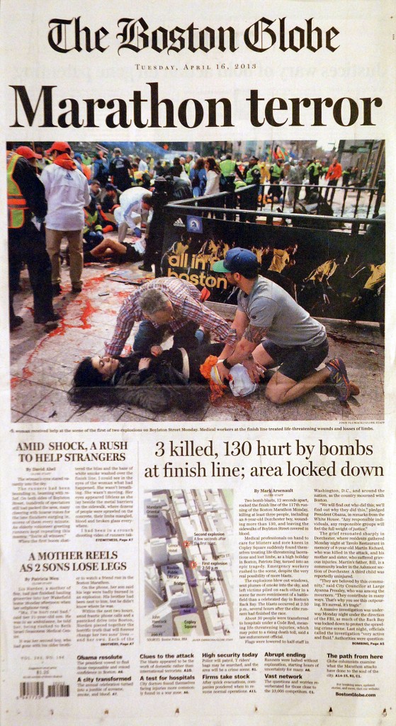
SND sudraba medaļa. Boston Globe maratona terorakta atspoguļojums.

«This is how you cover an event as it happens. It’s got depth, it’s got thought. It’s complete. It’s got all the pieces. It’s a simple design, but the design is enhancing the content.»
— SND35 long form judges

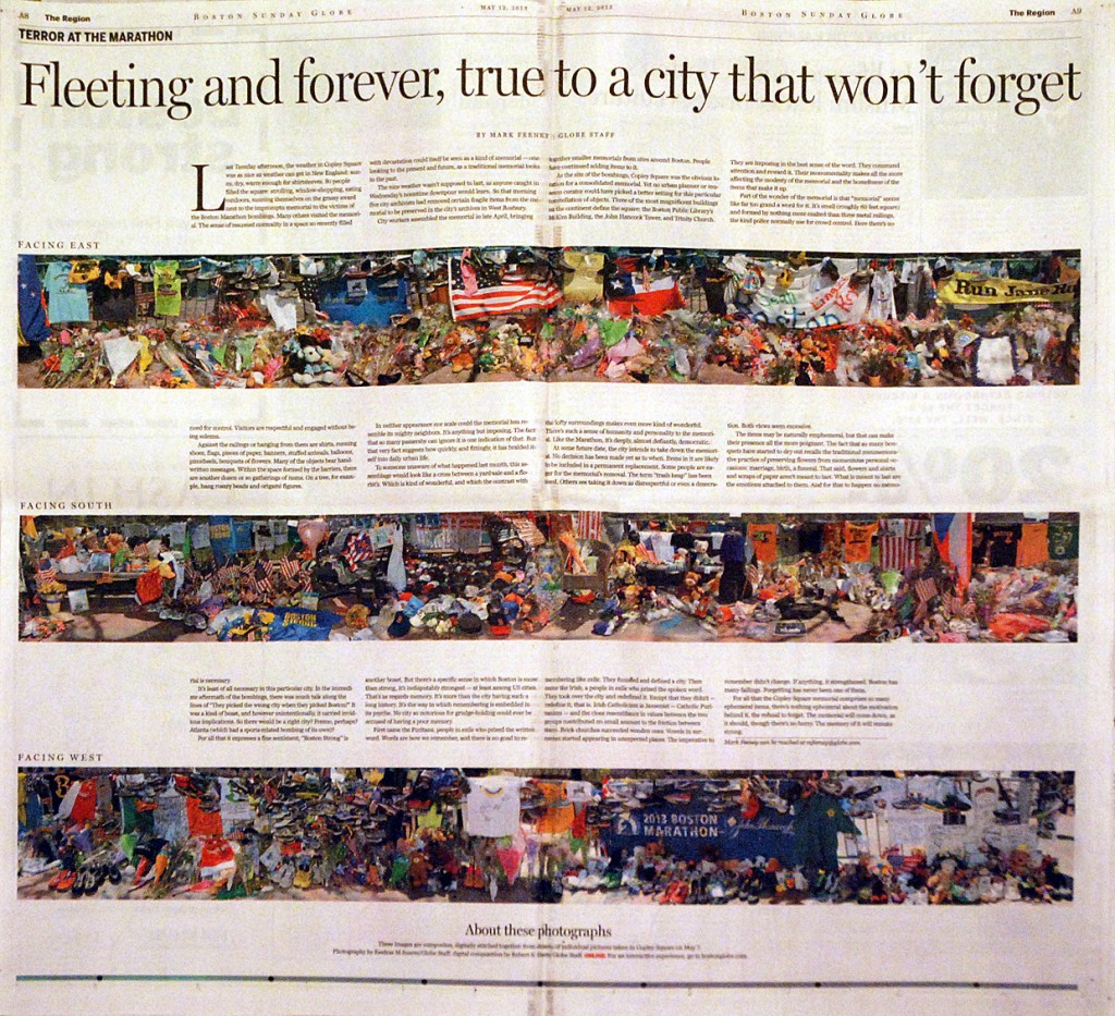
SND sudraba medaļa. Boston Globe maratona terorakta atspoguļojums. Otrais atvērums.

Bet netrūkst arī citu lielisku darbu. Piemēram, Times of Oman ir skaista avīze pati par sevi, ko nevarētu teikt par viņu mājaslapu. Ja kādam gadās netīšam paklupt Persijas līča dienvidu krastos, uzsaukšu pudeli viskija par pāris avīzes numuriem taustāmā veidā.

Un netrūkst arī vilšanās. Lieliskais zviedru Svenska Dagbladet ir sačakarējis kultūras pielikuma izskatu. Tagad tas ir gaužām neinteresants. Akurāt nav skaidrs, par ko viņiem ir izteikta tik augsta atzinība.

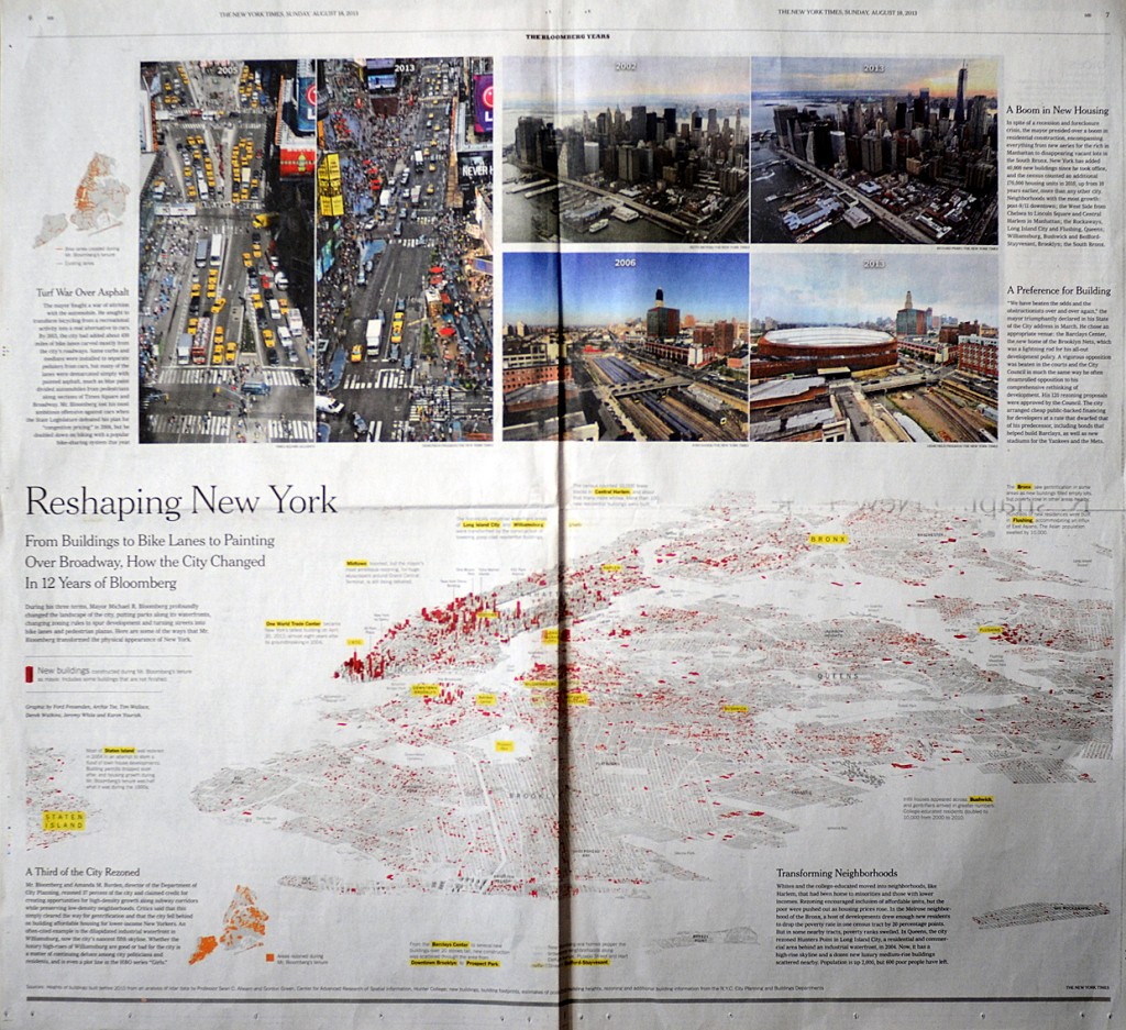
Pēdējos gadus SND konkursā vērtē arī digitāli radītos darbus un izskatās, ka šogad šajā lauciņā laurus plūks National Geographic. Bet neiztiks arī bez iepriekšējos gadus digitālajā jomā ne bez nopelniem izceltajiem New York Times ar infografiku un Boston Globe ar jauno mājaslapas dizainu. Arī šogad pieteikto darbu sarakstā ir New York Times prātam neaptverama darba rezultātā radītais izcilais vizuālais baudījums, kuru Society for News Design pelnīti atzinuši par sudraba medaļas vērtu.

SND sudraba medaļa. The New York Times — Reshaping New York atvērums.

Pēc tam, kad tiks paziņoti Society for News Design oficiālie uzvarētāji, sagatavošanā būs arī gadagrāmata, kurā SND publicē visus interesantākos darbus, ieskaitot tos, kas balvas nav ieguvuši. Un šī grāmata (ieskaitot arī visus iepriekšējo gadu izdevumus) vienmēr ir ļoti vērtīgs papildinājums bibliotēkai. Bet, pat ja neizdodas pie drukātā izdevuma tikt, SND mājaslapu pašķirstīt var bez maksas.

Brūsa Springstīna uzruna SXSW festivālā

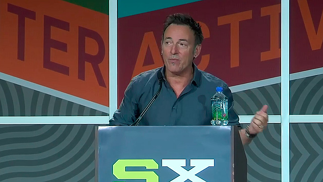
Bruce Springsteen's SXSW 2012 Keynote Speech video ekrānšāviņš.

Es ceru, ka šis video no NPR nepazudīs nekad un kļūs par visu laiku skatītāko ne tikai SXSW 2012 interesentiem: Bruce Springsteen’s SXSW 2012 Keynote Speech

Ja mums apkārt būtu vairāk cilvēku, kas ar tādu kaisli spētu pastāstīt par savu mūža nodarbi, iedvesmot cilvēkus un to visu apvīt ar tik kolosālu patriotisma devu, mēs būtu pavisam citi cilvēki.

It keeps you honest. It keeps you honest. Be able to keep two completely contradictory ideas alive and well inside of your heart and head at all times. If it doesn’t drive you crazy, it will make you strong. And stay hard, stay hungry, and stay alive. And when you walk onstage on tonight to bring the noise, treat it like it’s all we have. And then remember, it’s only rock and roll.

Es atļāvos no Rolling Stone raksta «Exclusive: The Complete Text of Bruce Springsteen’s SXSW Keynote Address» nokopēt arī visu viņa runas transkripciju, lai paliek, ko vēlos vakaros pārlasīt, ja nu tomēr tas video pazudīs.

Turpināt lasīt “Brūsa Springstīna uzruna SXSW festivālā”

Magazine Layout By Brad Hammerstron

Es šo tekstu pirmo reizi publicēju 2006. gada 21. aprīlī. Manas domas necik nav mainījušās.

———

Magazine Layout
By Brad Hammerstron

I do a magazine at least once a month.

We have standard sizes, 1/16, 1/8, 1/4, 1/2 and full page. That’s it.

Our pricing is NOT based on a per column inch rate like a newspaper because a 1/16 page ad usually takes about the same amount of time that a half page ad does, so, our prices are on a sliding scale where a 1/16th page cost is the most expensive. That way if the reps sell a TON of 1/16 (or the MOST common, a 1/4 page ad) we make nothing but gravy on the page.

Once you do one magazine, you’ll get a feel for who is a repeat advertiser and who is not. You can usually take the last issue and clean out all the editorial (except for the repeat editorial personalities or sections) and leave the ads that you think will run again.

Then, as the sales are being made you do a dummy. This is sometimes a bunch of paper that you fold up by hand to imitate the magazine or an InDesign Dummy where you kind of know what advertisers you have. You place the ads so that they don’t compete with each other and the pages are about 25-50% advertizingadvertising on your ratio, some advertising rags go as high as 70% but they’re not magazines.) Once you have all the ads in place THEN you fill the rest with editorial. Hopefullly Hopefullyore than enough editorial to fill the mag, or you’ll be doing callouts and BIG headlines and graphics to fill up the space.

The ads are the most important part. Editorial comes second. You can cut paragraphs, stories, stretch stories over two or three pages to make it fit but you cannot do that with ads. Those are your bread and butter.

Once you have the ads all in place (don’t need to have them designed or proofed yet – just the placement then you drop in the editorial. Pour the editorial over the top, like milk. Let it settle so that the top of your text is even, all your columns line up. (All your text baselines MUST line up or your text will look funny)

Chose 1 font for paragraph text. It should ALWAYS be the same leading and the same point size. Use a common font for this – DO NOT use anything out of the ordinary or “Unique”. If your Art director suggests using anything fancy or weird, ignore him/her.

All your headlines should be the same font as unless there is ONE article in particular you want to get fancy with. DO NOT use more than that or your magazine will look childish.

If you have more than one article on a page, the top headline should be the boldest. Subsequent headlines should get smaller and smaller as they decrease in size and importance.

Your cut lines (captions) should be one point smaller than your paragraph text and italicized. Do not use indentation, bullets or hyphenation on captions.

Your choices are paragraph font, font size and justification you can choose full justification or left aligned, leaving the right jagged sometimes), headline font (size varies), justification , and cut line justification. This is called your style sheet.

Once you have designed one magazine, save these styles in your style settings so that you can easily highlight text and choose a style, whether it’s headline, paragraph or cutline.

Callouts are when a story doesn’t QUITE fit the page and you need to make it a little larger. You pick the most profound sentence in the article and duplicate it in the middle of the story, larger and bold, perhaps a different colour, that’s up to you. It’s a cheat.

Bylines can have their own style too, either use your cutline style or create a new one that looks good, but keep it consistent.

Do your best to avoid clipart. There is no place in a magazine for clipart except in ads (and even then, do your damnedest to avoid it). If you need a graphic for an editorial piece, find a photograph. Clipart is for kids.

Most importantly, find a cover shot. Do not use clipart or put ads on the cover. Find a cover shot early on. there is nothing worse than having an entire magazine done and you’ve got nothing on the cover.

I’ll assume you have your masthead done already. Keep that consistent. Do not move it. It should be bold. It doesn’t necessarily have to be catchy – that’s what your cover shot is for. You can play with it, depending on what the cover shot is.

That’s a start anyway.
Arī «lieli» cilvēki kļūdās sīkumos jeb Sharpen jālieto uzmanīgi

Es neesmu USA Today auditorijas pārstāvis, tomēr šis pa pus pasauli pagājušajā nedēļā izskandinātais muļķīgais izgājiens nevarēja palikt nepamanīts.

Kaut arī zināšanas par aizpeļķes iedzīvotājiem un viņu tautas varoņiem nav īpaši lielas, tomēr par Raisas kundzi priekšstats lielākoties cilvēciņiem tomēr būs iesēdies. Nopietna tante, galu galā.

Tad nu kā gadījies, kā ne, viens no svarīgākajiem ASV izdevumiem publicē 19. oktobrī rakstu par savas nācijas karaspēka gaitām tuvākajos 10 gados, kuros iesaista arī tantes Raisas izteikumus. Nu un protams, pievieno The Associated Press fotogrāfa bildi. Viss jau būtu labi, ja tikai fotonodaļā kāds nebūtu pārcenties ar Sharpen filtru lietošanu, kas noveda pie savdabīgiem rezultātiem:

ASA Today Rice won\'t rule out U.S. troops in Iraq in 10 years photo

Pa kreisi mēs redzam bildes oriģinālo versiju, pa labi — nedaudz pielaboto. Brēka sākās ļoti nopietna un tagad pie jau minētā raksta «Rice won’t rule out U.S. troops in Iraq in 10 years» ir lasāma arī redaktora piezīme:

Editor’s note: The photo of Condoleezza Rice that originally accompanied this story was altered in a manner that did not meet USA TODAY’s editorial standards. The photo has been replaced by a properly adjusted copy. Photos published online are routinely cropped for size and adjusted for brightness and sharpness to optimize their appearance. In this case, after sharpening the photo for clarity, the editor brightened a portion of Rice’s face, giving her eyes an unnatural appearance. This resulted in a distortion of the original not in keeping with our editorial standards.

Tā teikt: kam negadās, labi tikai, ka ne ar mani.